Going 🌑 Dark-mode first!
/ 3 min read
What if I told you my blog now defaults to Dark Mode, regardless of your system settings? Yes, you heard that right.
My Blog Goes Dark Mode First: Why It Makes Sense
Let’s flip the script on conventional wisdom about web design. What if I told you my blog now defaults to Dark Mode, regardless of your system settings? Yes, you heard that right. When you arrive, it’s the Dark Mode that welcomes you. Oh, and if you’re looking for Light Mode, it’s now an optional experience. Intrigued? Let’s dive into the ‘why.’
const piraffeTheme =
		storedTheme ||
    (window.matchMedia("(prefers-color-scheme: light)").matches
    ? "dark" : "dark"); /* 🌘 vs. 🌒 = 🌑 */
The Power-Saving Charm of Dark Mode
The most obvious benefit is power conservation, especially for OLED screens. Unlike LCD screens where the backlight is always on, OLED technology lights up individual pixels, consuming power only for non-black pixels. Dark Mode, with its abundance of darker pixels, requires less energy, making your battery last longer. Who doesn’t love an eco-friendly browsing experience?
A Visual Comfort Zone
Another reason is that Dark Mode reduces eye strain, especially in low-light conditions. Staring at a bright screen at night? Not very comfortable. Dark Mode provides a cozy reading atmosphere, thus enriching your late-night binges on tech articles and coding tutorials (I know you do it!).
An Aesthetic Statement
Dark Mode brings a modern, sophisticated aesthetic to the table. It’s a visual signal that this blog is more than just a collection of text and images; it’s a curated experience. The sleek, moody appearance enhances your focus on the content, making the blog not just a place to read but a space to ‘be.’
User-Controlled Light Mode
For those who find the conventional wisdom a bit too, well, wise, fear not! Light Mode is just a click away. We believe in choice; we’re just making Dark Mode the first choice you encounter.
The Elon Musk Xperience
Remember when Elon Musk announced that the Twitter X platform would exclusively use Dark Mode? That was a bold move, echoing what some might call an “Elon-level” audacity. However, after much public debate and user feedback, Musk did an about-face, making Dark Mode the default but not the only choice. While it sparked conversations around user autonomy, it also spotlighted the viability of Dark Mode as the primary user interface. It’s almost like Musk’s initial rigidity was the nudge society needed to consider a Dark Mode-first approach seriously.
Why Designing for Lower CO2 Impact Matters
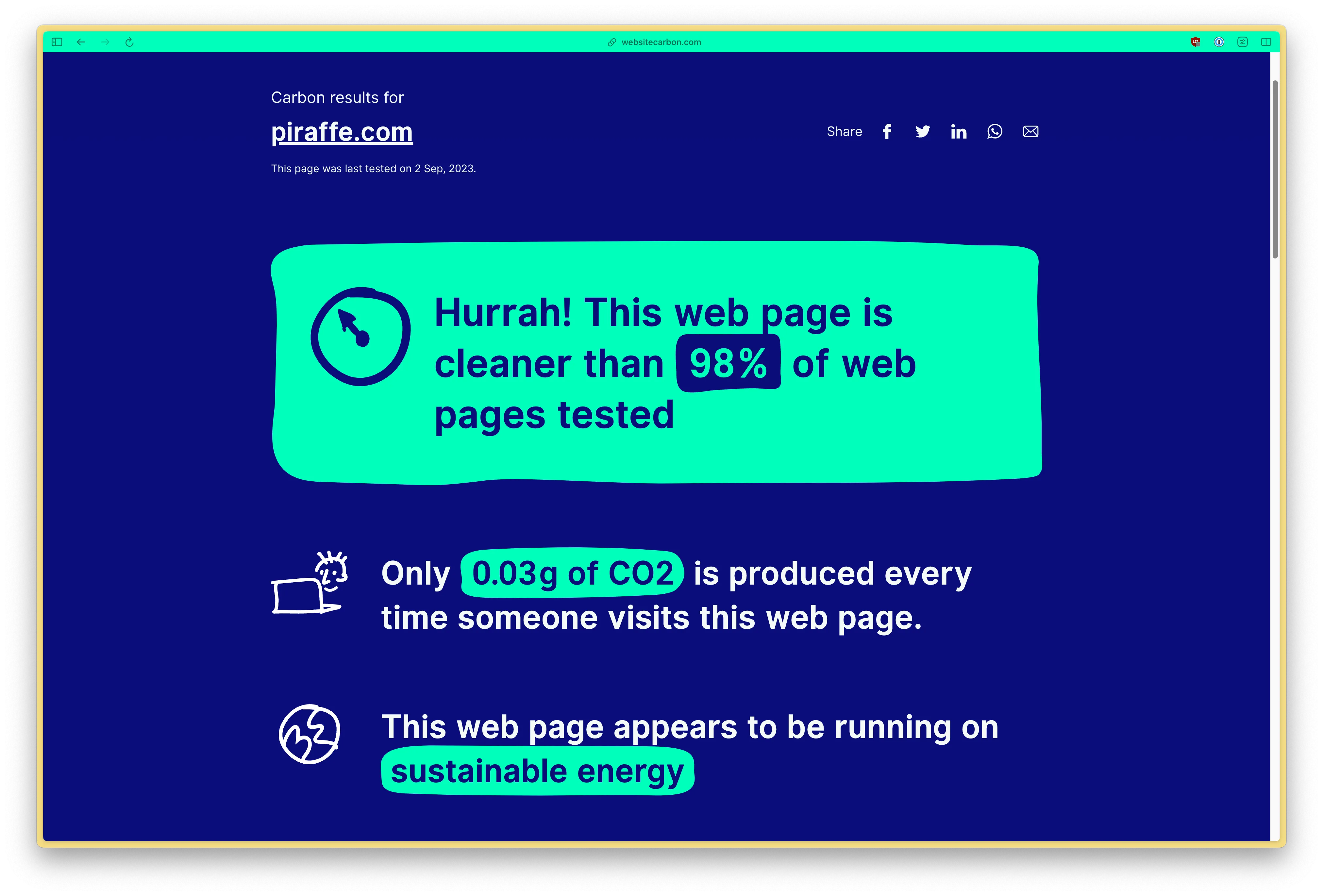
While we’re on the subject of power conservation and aesthetics, let’s touch on CO2-friendly web design. Sites like Website Carbon evaluate the carbon footprint of your website, but interestingly enough, they don’t yet account for color schemes. Imagine if they did! Dark Mode could contribute to a lower carbon footprint, given its energy-saving traits, particularly on OLED screens. A Dark Mode-first or Dark Mode-only design can become more than a style or power-saving choice; it could be an eco-conscious decision too.
Isn’t it time we broaden our perspective to see Dark Mode as not merely a ‘cool feature’ but as an ally in our fight against climate change? We can all do our part, one pixel at a time.

Parting Thoughts
In summary, Dark Mode is no longer an alternative; it’s the default. It saves power, offers visual comfort, and adds a splash of aesthetic sophistication. Don’t worry; if you’re a Light Mode aficionado, your preference is still honored—it’s just not the first thing you’ll see.
So, welcome to the dark side—we have more than just cookies here; we’ve got a whole new experience awaiting you.